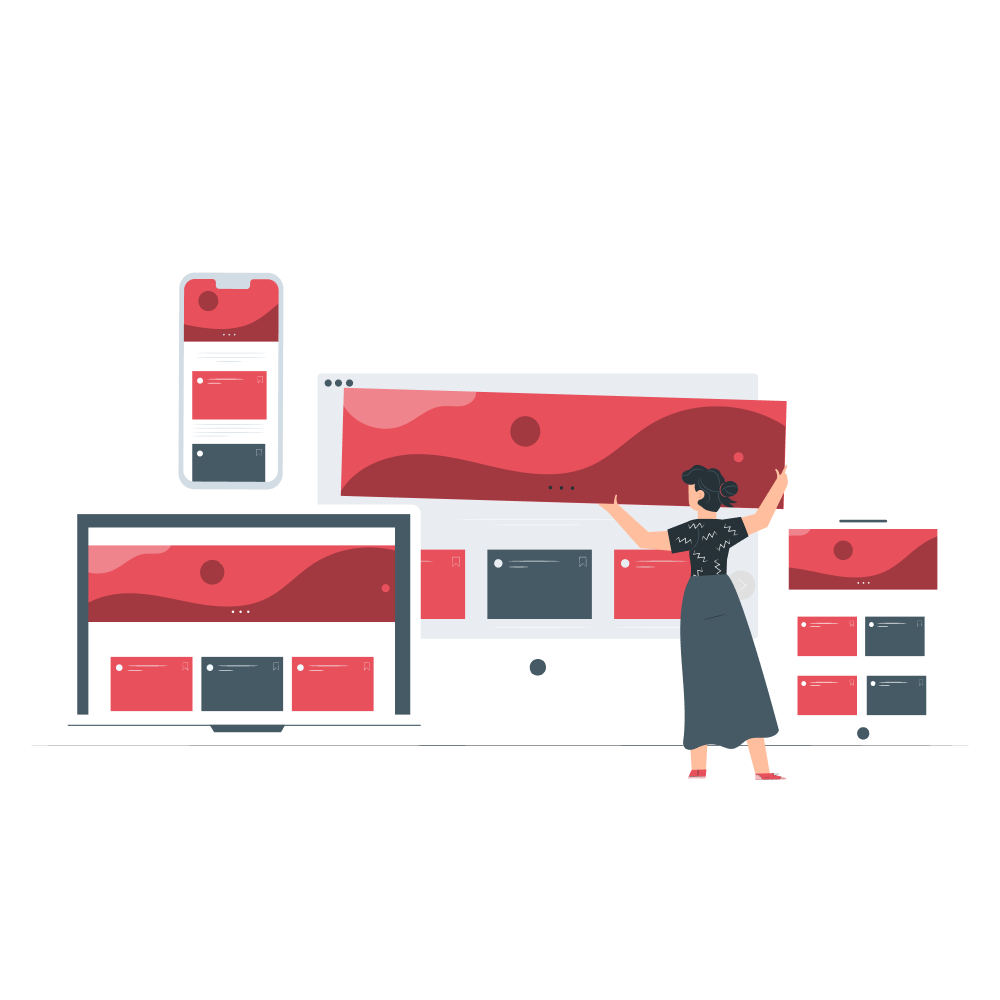
Responsive web design means the content going to add and flow, its going squish and release
consistently as the device or browser size changes.it makes your website flexible. Adaptive web design is going to adapt at certain sizes.
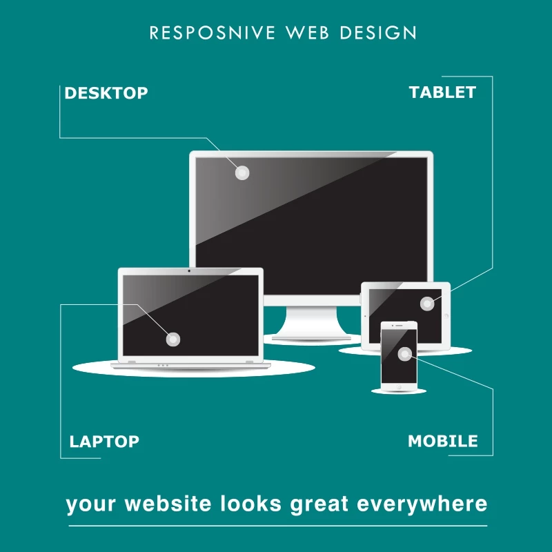
Now a days internet is important part of a media. The mobile usability is increased rapidly
in the world. More than 80% of people who searches there query through mobile devices.so if you don’t want to loose any potential client
make sure you have mobile responsive web designed from this you can get more happy visitors to your website and you can convert them to
happy customers. Well we can help you t get responsive web design services in Bangalore.
Now a days internet is important part of a media. The mobile usability is increased rapidly in the world. More than 80% of people who searches there query through mobile devices.so if you don’t want to loose any potential client make sure you have mobile responsive web designed from this you can get more happy visitors to your website and you can convert them to happy customers. Well we can help you t get responsive web design services in Bangalore.


